Technology & Careers · TALE24 REVIEW
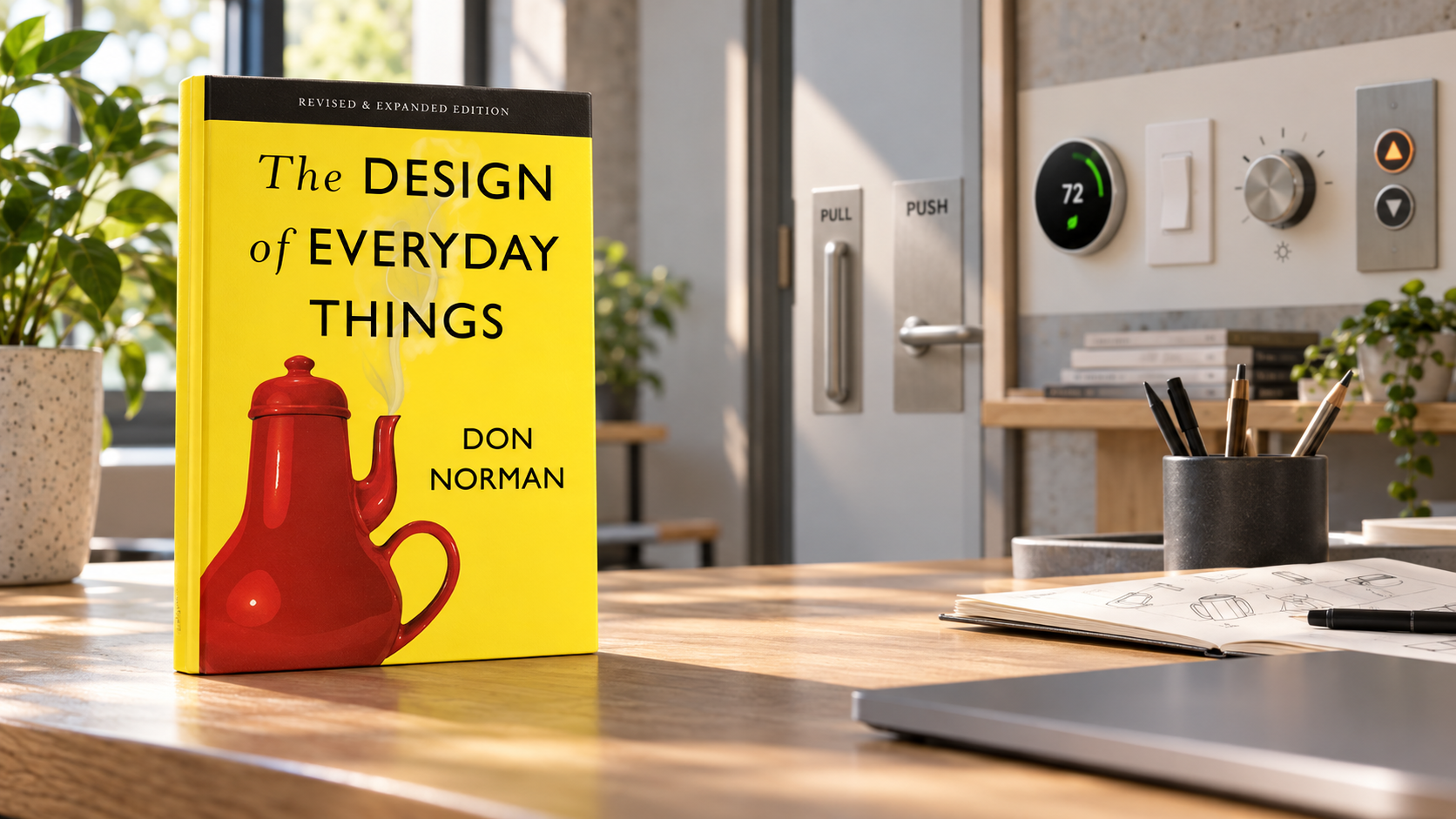
The Design of Everyday Things: when the fault is not necessarily the user's
From doors that are difficult to open to software interfaces, Don Norman shows how good design makes right actions easy to understand and mistakes easy to recover from.
Easy-to-apply concepts, real-life examples, and effective changes to the way product teams view user errors
Everyone has stood in front of a door with a beautiful handle but didn't know whether to pull or push. When making the wrong choice, the first reaction is often to blame yourself for not paying attention. The Design of Everyday Things starts from small moments like these to introduce an important change: if a lot of people make the same mistake, perhaps the problem lies in the design and not in individual clumsiness. A good widget should demonstrate its use, or at least provide clear enough feedback for the user to quickly correct mistakes.
Don Norman builds a vocabulary that helps you see familiar objects with new eyes. Affordance is about the ability to act that an object provides; signifier is a sign that shows where the action is located. A flat surface on a door may suggest pushing, while a handle suggests pulling. In digital products, buttons need to look and behave like something that can be clicked. When the interface removes all markings to achieve a minimalist look, users are forced to experiment. Visual cleanliness is then purchased at a cognitive cost.
Mapping is the relationship between control and results. Four switches arranged in the same position as the four stoves help us make the right choice without needing labels. If they lie in a row without contact with the stovetop, each cooking session becomes a memory test. This principle appears in countless products: volume buttons, car seat controls, settings panels or room arrangements in a smart home application. Intuitive design is often not about users being “intuitive”; it is because spatial relationships are clarified.
Feedback answers the question whether the action has occurred. A payment button that changes status, displays progress, and prevents double clicks to help users avoid submitting orders twice. But feedback shouldn't just be a cosmetic effect. It needs to be at the right time, at the right level, and to tell the system state. A loading bar that stays at 99% can be worse than a notification that a task is waiting for the server. When the system is silent, people create their own explanations, usually "I did something wrong".
The book distinguishes between slip and mistake. Slip occurs when the target is correct but the action is wrong, such as pressing the wrong button next to each other. Mistake occurs when users form the wrong plan because they misunderstand the system. Two types of errors require two ways to handle them. Spacing, confirmation and undo can reduce slip; Clear conceptual models, contextual instructions and easy-to-understand language help reduce mistakes. Lumping it all into “user error” causes the product team to miss the opportunity to fix the cause.
Resilience is something I find particularly valuable. Good design does not assume humans will always be accurate. It allows to preview, undo, save versions or restore data. A dialog box asks “Are you sure?” Every operation will quickly be clicked out of habit; Preventing serious consequences requires better structure, such as putting deleted items in the trash and allowing time for recovery. The goal is not to prohibit mistakes, but to make them cheap, easy to see, and have a way to return.In software teams, a large gap often lies between the builder's model and the user's model. Programmers know that data is saved by account, so a menu structure is obvious; Customers think in terms of projects or tasks that need to be completed. Both have logic, but the product is only easy to use when the display model is close to how the user envisions it. Interviews, observations, and usability testing help detect this gap better than a meeting where everyone already knows the system too well.
One limitation of applying Norman's principles is that “understandability” is not exactly the same across all groups. Signs that are familiar to young people who use phones every day may be unfamiliar to older people; Insufficient colors for people with visual impairments; Swiping gestures can be difficult for people with limited mobility. Human-centered design is plural: people with different bodies, languages, experiences, and conditions of use. No average user represents it all.
Books also help look at instructional materials differently. A product doesn't necessarily fail just because it requires learning; Professional cameras or technical tools have real complexity. The issue is whether the difficulty is commensurate with the task or is it caused by the arbitrary structure. When process complexity cannot be eliminated, the system should bring knowledge out of memory: checklists, visible states, safe defaults, and timely instructions appear. Forcing users to remember everything shifts design costs onto them.
After many years, the technology examples in the book may be old but the observations remain durable. Walking around a room, we can ask what signals each object is emitting, what states are hidden, and what errors are attributed to the user. With one screen, try completing the task without relying on the team's memory. These simple questions often reveal problems faster than arguments about aesthetic trends.
The Design of Everyday Things doesn't promise to turn everyone into a designer after one reading. Its value is to correct the blame reflex. When someone makes a mistake, instead of asking “why didn't they read carefully?”, we can ask what signals led them to that choice, how the system responded, and how the consequences can be reduced. Small changes in questions create a kinder product. It also creates a realistic view of humans: we are busy, forgetful, and still deserve tools that don't punish us for a split second of inattention.
EDITOR’S VERDICT
Tale24’s assessment
Easy-to-apply concepts, real-life examples, and effective changes to the way product teams view user errors
Points to considerSome technology examples are dated and need to be expanded with a modern accessibility perspective
Best for: Designers, programmers, product managers, and anyone who builds tools for others to use
Editorial method: This is an independent assessment informed by the work and its official supporting information. AI tools may assist the drafting process; Tale24 reviews and takes responsibility for everything it publishes.